Introducing the New Peerspace
-
Editorial Team
- December 14, 2022
- 3 min read
- Updates
Since 2014, Peerspace has operated the largest network of unique venues for meetings, events, and productions across the globe.
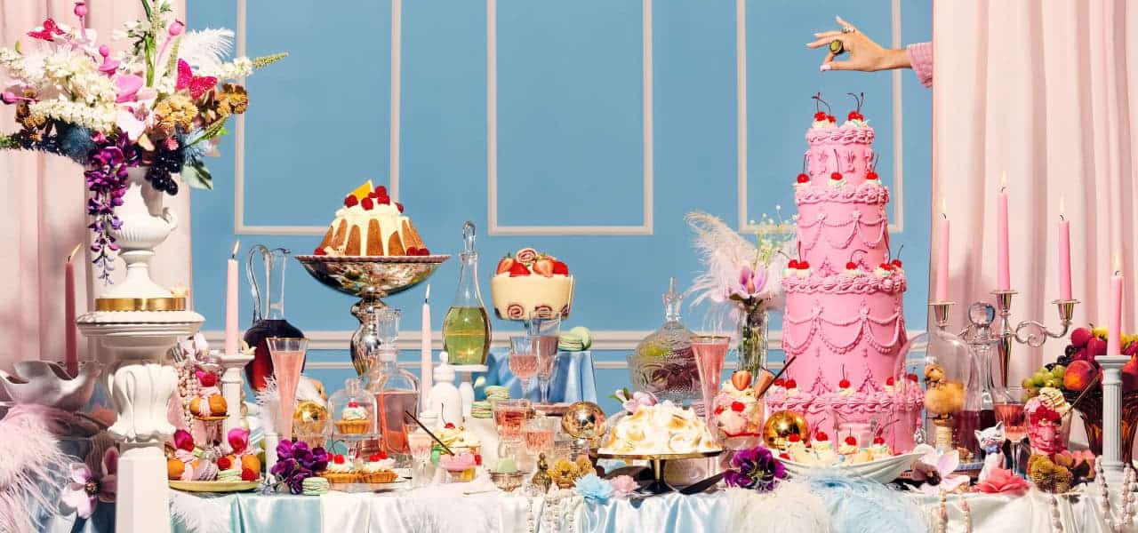
Over the last eight years, we’ve seen something extraordinary. Peerspace customers—photographers and filmmakers, entrepreneurs and event planners—have brought an incredible level of creativity to their everyday ventures, using space to elevate their creativity and orchestrate landmark moments in their lives. They’ve shot award-winning campaigns, celebrated brides and grooms, and grown small businesses. They’ve unlocked their own potential and the potential of others in ways we never imagined.
As we stepped back to look at these extraordinary moments, we realized it was time for the Peerspace brand to evolve. We want to be a source of inspiration, and we owe it to our audience to be a brand that elevates, excites, and empowers those who want to bring their creative ideas to life. We want our spaces to propel you to produce your best work or celebrate your most memorable moments.
So, with the help of Mother Design, we reimagined our brand.

Welcome to the new Peerspace.
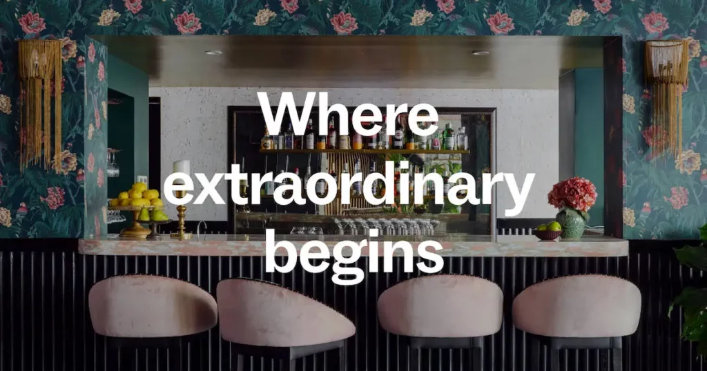
It’s more than a fresh coat of paint; it’s a tribute to our customers. A dynamic visual world that lets the people and their stories shine. And it reflects who we are at our core: a place where every moment can reach its full potential.
We began with visual iconography that’s inspired by our core offering: space. The range of Peerspace listings is truly special, so our wordmark and logos reflect the personality of those spaces—architecture and environments with histories, character, and spirit.

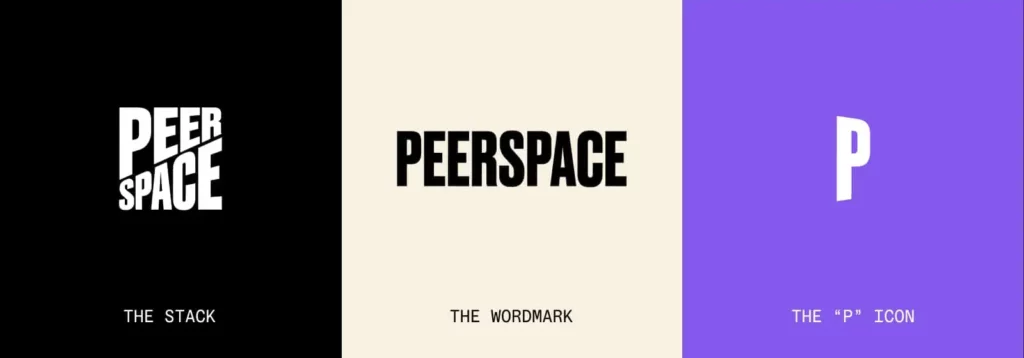
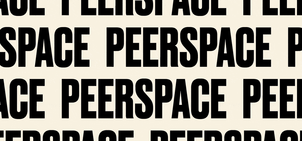
The Peerspace Wordmark, for instance, is floor-to-ceiling bold, modern and monumental. Like a historic analogue poster printing, it’s a mark that boldly announces itself.
The Stack is our most dynamic; mural-like and wholly original, it takes the eye on a journey up, right, left, and over, zagging from corner to corner of the space it occupies.
The “P” Icon is a simple, minimal monogram, angled to reference dimension, or the opening of a door to endless possibility.
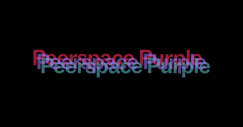
As for that fresh coat of paint? It’s our signature Peerspace Purple: a blend of our brand’s two previous colors that not only symbolizes our company’s beginnings, but represents creativity, inventiveness, and imagination. Our hope is that—much like our spaces—the color inspires out-of-the-box thinking and supports our guests in bringing their big ideas to life.
We want to give our new and existing customers the confidence they need to launch their venture, breakthrough in business, or throw their next spectacular gathering.